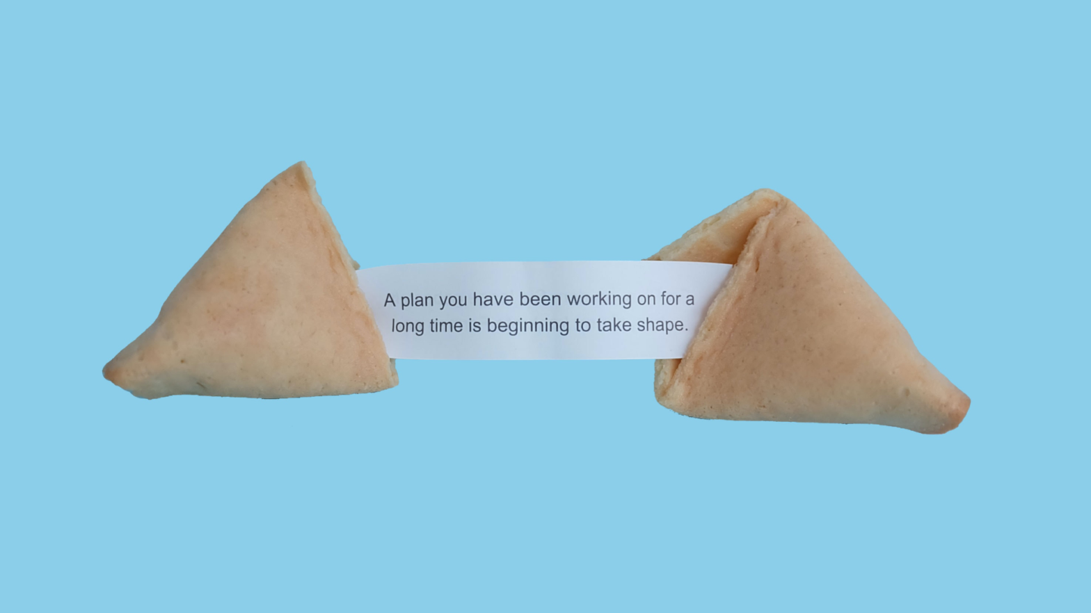
Photo by Elena Koycheva on Unsplash
If you’re like me, you’re anticipation is growing uncontrollably as you approach your Kickstarter launch! At this point, you may have started wondering what tweaks you can make to give your campaign just a little bit more of an edge. Well, that’s what this series is all about! I plan to use data from literally thousands of Kickstarter projects to find out what changes you can make to your campaign that will maximize your chance of success.
But before we dive in to all that data goodness, there’s an important point that I need stress as much as possible.
There are no shortcuts. The biggest factor to your Kickstarter’s success is the quality of your product and campaign page.
I know it may seem obvious, but it’s incredibly important to understand that the biggest factor to your success is the quality of your product and the quality of your campaign page. Preparing for and running a Kickstarter campaign takes a lot of effort, and the questions I plan to address in this blog series should not be viewed as shortcuts – because they aren’t. No amount of launching at the right time, having the right number of pledge tiers, or having the ideal campaign length will save a project that doesn’t have the necessary effort to back it up.
Every blog entry that I write from here on out will be based on this one idea. We will always start with the assumption that you have a good idea, and that you’ve put in a reasonable amount of effort toward its success. Now, I do have plans to cover a few things you can do to improve the quality of your campaign page overall, but most aspects of a page are just too difficult for me to quantify.
On a more upbeat note though, I don’t think that assumption is a very difficult one to make. The fact that you’re even reading this blog suggests you’re willing to put in the effort to help your campaign succeed.

Leave a Reply